How Many Screenshots Does a Help Article Need? One per Decision, Not One per Click
Most help articles have too many screenshots or none at all.
The catch: both feel right to the person writing them. Too many feels thorough. None feels quick.
So how many screenshots in a help article? Add one wherever the reader has to find or choose something on the screen, and skip the rest. For a short task, that's often a few images, not one per click. A simple test: if removing the screenshot would leave the reader hunting, keep it.
In this post, we'll take a real recorded task, look at what it captured and trim it step by step.
The Real Test: Three Shapes in Excalidraw
We recorded a short task in Excalidraw, the open-source whiteboard app. The task: draw a rectangle, an arrow and an ellipse.
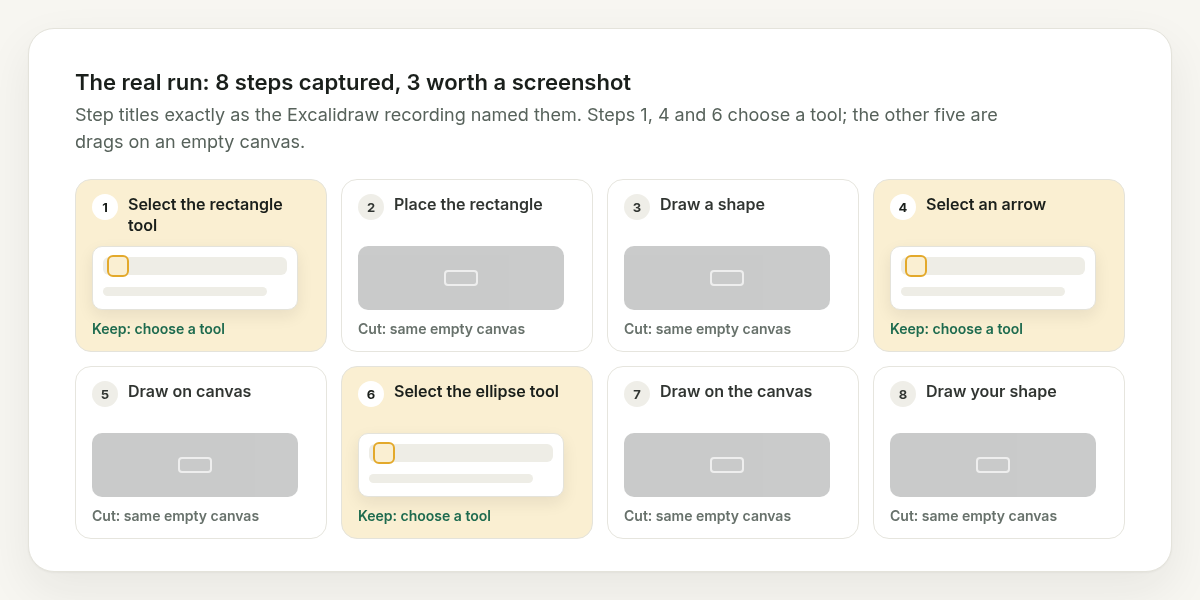
The recording took one screenshot per click. That gave us a guide with 8 steps and 8 screenshots.
Here are those 8 steps, exactly as titled:
- Select the rectangle tool
- Place the rectangle
- Draw a shape
- Select an arrow
- Draw on canvas
- Select the ellipse tool
- Draw on the canvas
- Draw your shape
See the problem?
Steps 1, 4 and 6 pick a tool from the toolbar. The other five are all drags on the canvas. In the published guide, those five screenshots look almost the same: a dark, empty canvas with a highlight box in the middle.
Five near-identical images. After the first one, the reader learns nothing new.
One per Decision, Not One per Click
Why does this happen?
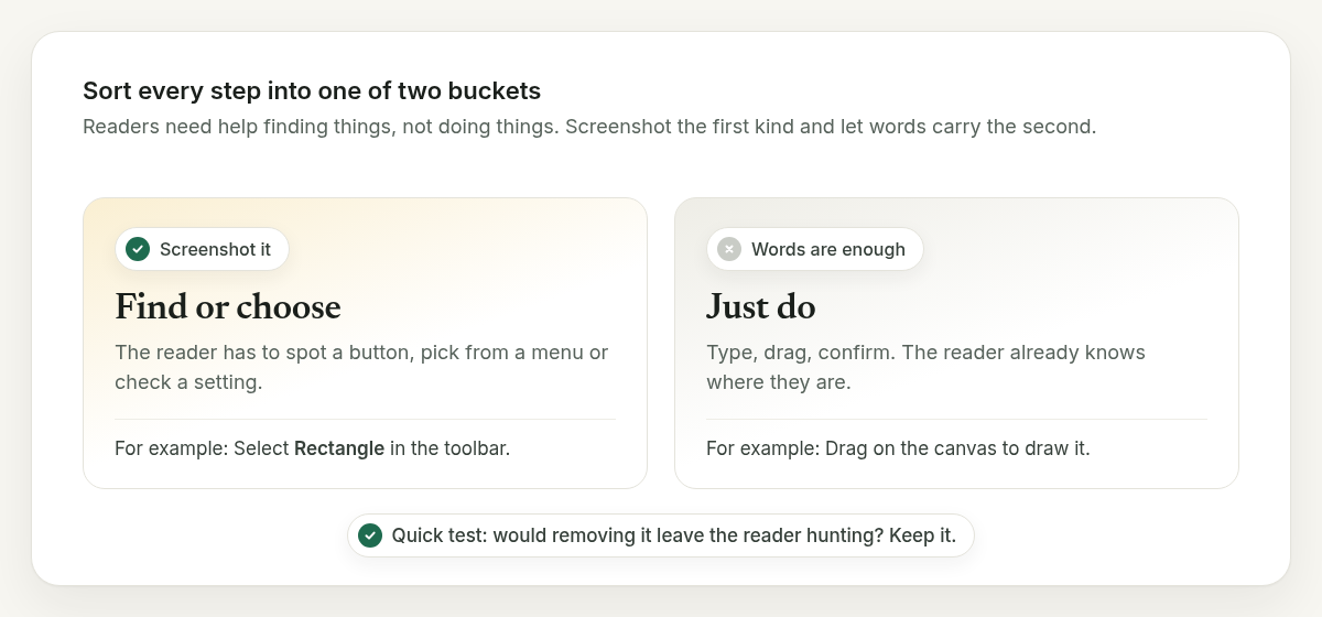
Because "one screenshot per click" counts actions. Readers rarely need help with actions. They need help with finding things.
So sort every step into one of two buckets:
- Find or choose: the reader has to spot a button, pick from a menu or check a setting. Screenshot it.
- Just do: the reader already knows where they are. Type, drag, confirm. Words are enough.
For example, "Select Rectangle in the toolbar" is a find step. The toolbar is a row of small icons, and a picture saves a lot of squinting. "Drag on the canvas to draw it" is a do step. Nobody needs a photo of an empty canvas to understand that.
The Trimmed Version
Apply that rule to the Excalidraw guide and you get this:
- Select Rectangle in the toolbar, then drag on the canvas to draw it. (Screenshot: the toolbar, Rectangle highlighted.)
- Select Arrow, then drag on the canvas to draw the arrow. (Screenshot: the toolbar, Arrow highlighted.)
- Select Ellipse, then drag on the canvas. (Screenshot: the toolbar, Ellipse highlighted.)
Three steps, three screenshots. Every image shows a choice.
Could you go lower? Yes. All three tools sit in the same toolbar, so one screenshot with all three marked would work too (that's the juicy bit: sometimes one picture answers three questions).
Then add one image at the end: what the finished drawing should look like. That's the "did it work?" check, and it's the one writers forget.
Five Questions to Ask About Every Screenshot
Not sure whether one stays? Run it through these:
- Does the reader have to find something here? If not, cut it.
- Is it different from the last screenshot? If it looks the same, cut it.
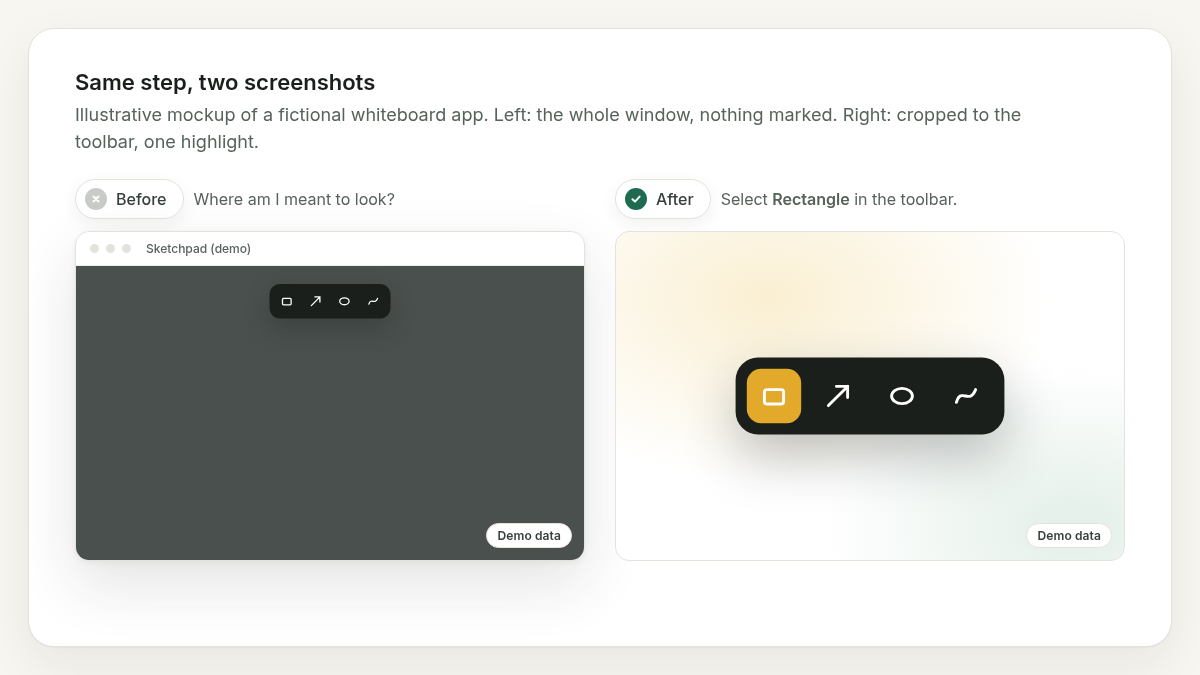
- Is there one clear highlight? If you can't say what to look at, the reader can't either.
- Is it cropped to the part that matters? A full browser window hides the button in plain sight.
- Would the text be wrong without it? If the words make sense alone, the image is a bonus, not a need.
For example, step 5 in the Excalidraw run ("Draw on canvas") fails questions 1, 2 and 5. Gone.
What About Longer Articles?
Longer tasks follow the same rule. They just have more decisions.
A settings page full of fields might need two screenshots: one to show where the page is, and one for the field people get wrong. The rest can be a bulleted list.
For example (a made-up form), "Enter your company name, address and tax ID" is one line of text. "Choose Monthly under Billing cycle, because it starts on Yearly" might deserve a picture, since that's the setting people miss.
Why Fewer Screenshots Is Kinder Later
Every screenshot is a promise that the screen still looks like that.
When the app gets a redesign, each image is one more thing to retake. Eight images means eight retakes. Three means three.
I'll be honest: I used to think more screenshots meant a more helpful article. Mostly, it meant a longer one.
The Wrap-Up
So, how many screenshots in a help article? As many as there are moments where the reader has to find or choose something. Usually fewer than you captured.
One per decision. One highlight each. One "here's what done looks like" at the end.
Fewer pictures, clearer steps.
Written by the Asterly team.